New Theme - LightStrict
Today, the release of the new version of the ModPlusStyle design library was released, in which some minor corrections were made, as well as the possibility of finer tuning of design themes. And these features were immediately applied to a new topic.
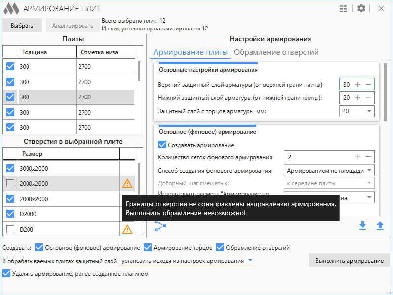
LightStrict is a light but austere theme. Pleasant light gray colors with an admixture of blue and a touch of severity of right angles. But you may not immediately notice what is the peculiarity of this topic. Let's look at an example of a window of the recently released Slabs Reinforcement plugin:

The very first thing that should immediately catch your eye is that the background color of the buttons in this theme does not match the accent (blue) color of the theme. The effect is also different when the mouse hovers over the buttons.
The second main difference from all the others that can not immediately catch the eye is the absence of rounding. Even in small things, such as scrollbars or tooltips.
I am sure that this design theme will find its users. And I, in turn, promise that over time I will definitely make new changes to make working with ModPlus more pleasant and comfortable!


